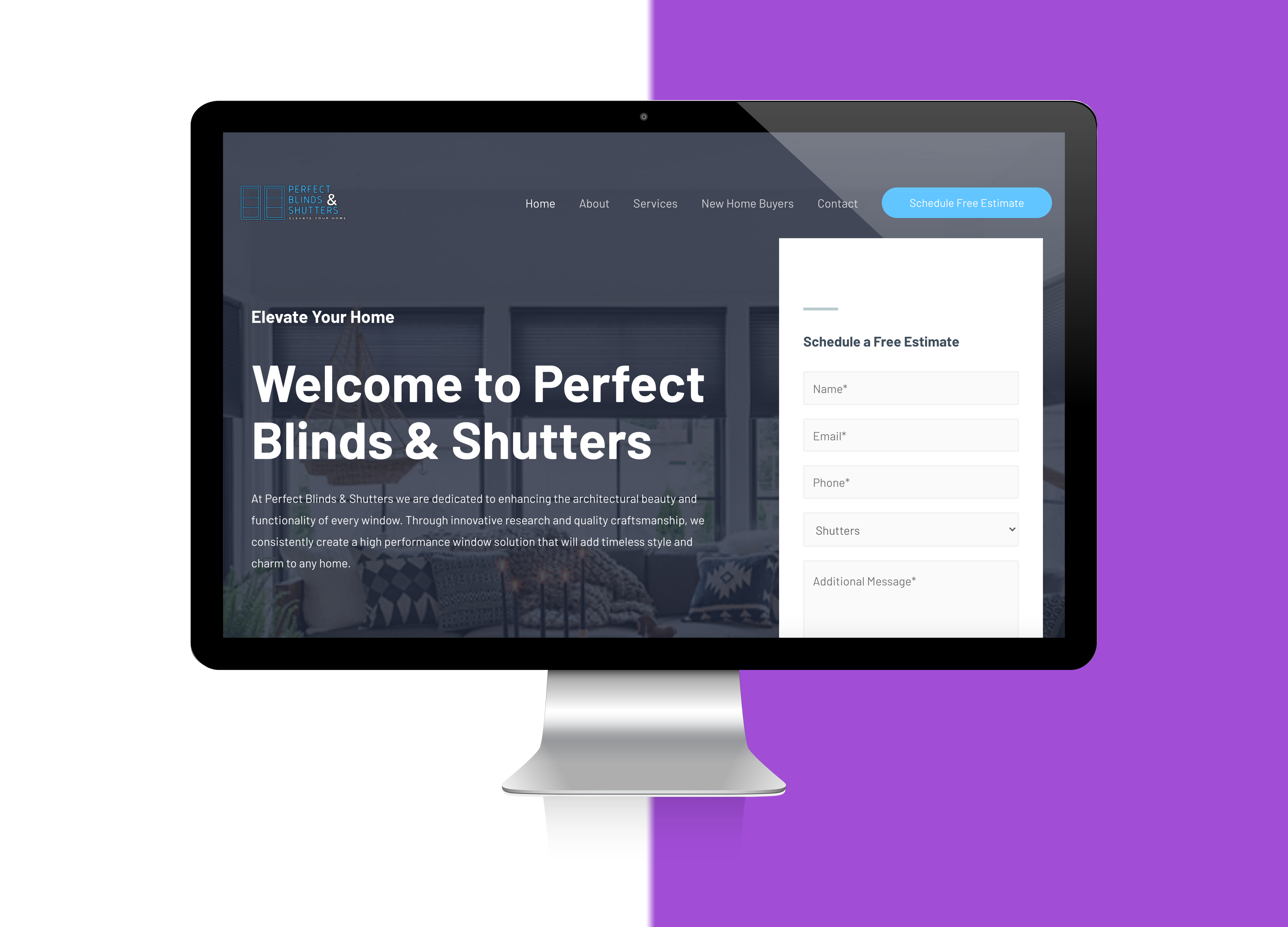
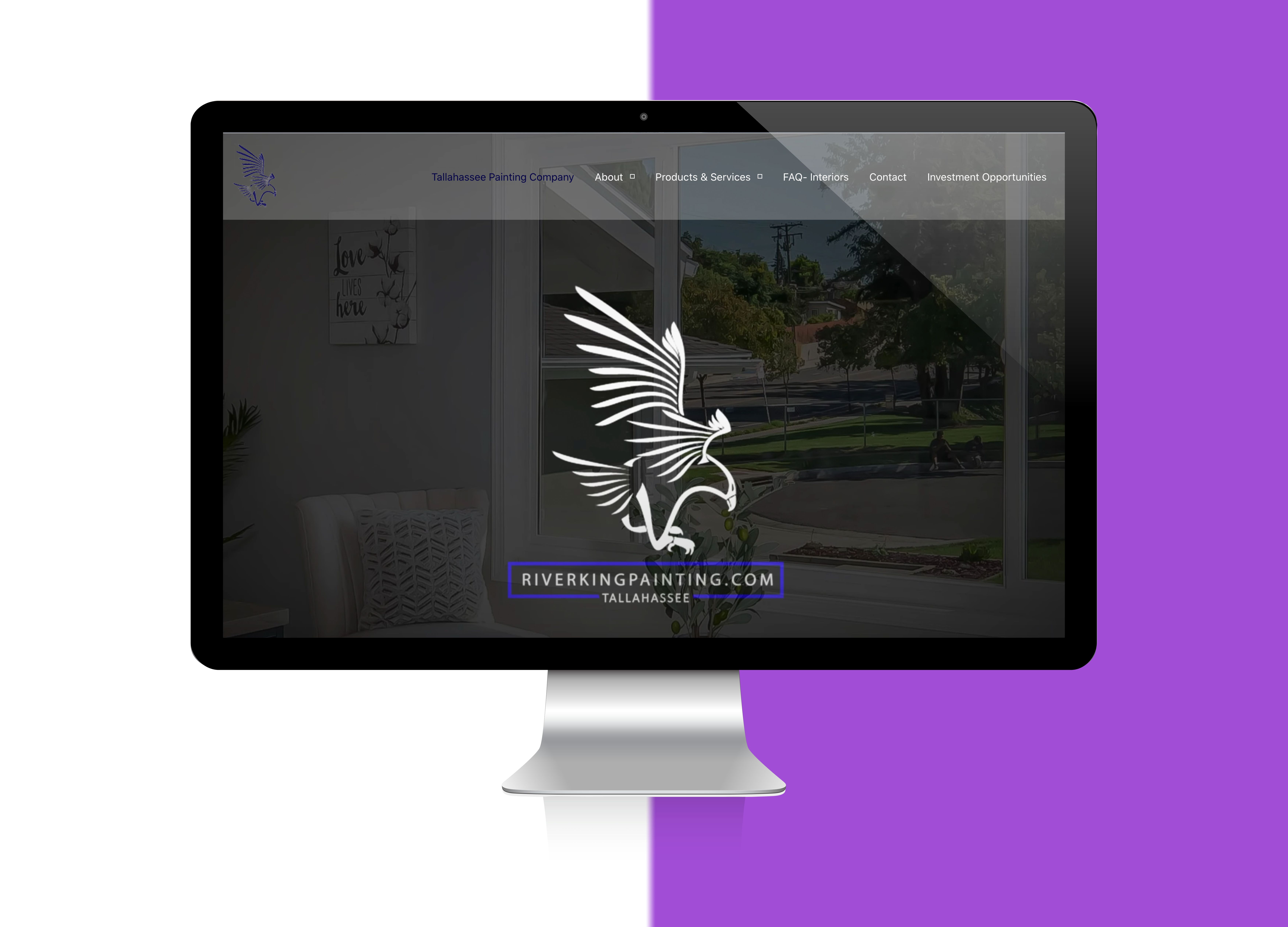
For a website to be termed responsive, one should be able to browse it from any kind of browser or platform. It is a smart way of appealing to web visitors on multiple platforms and offers a fulfilling browsing experience that matches or exceeds the experience on a regular computer. Responsive web design leads to websites of a light and flexible nature which are easy to navigate through, and enable users to conveniently find what they are looking for. These include iPhones, iPads, iPods and all smartphones in general. Today, such communication tools have become the industry standard. It means one cannot ignore the gains which responsive web design delivers if you want to keep up with your competition.
Our seasoned professionals are skilled in making websites responsive without disrupting how the site is laid out. When clients access your site online via mobile gadgets, it needs to have the same appeal as the desktop version. We have versatile expertise and experience in achieving desired results in this area.


